Introduction to Color and Typography in Packaging
The strategic application of color and typography in packaging design represents one of the most influential factors in consumer perception, brand recognition, and purchasing behavior. These fundamental design elements work synergistically to create immediate emotional connections, communicate brand values, and guide consumer decision-making processes in increasingly competitive retail environments.
Modern packaging design color typography strategies have evolved far beyond aesthetic considerations to encompass sophisticated psychological principles that influence consumer behavior at both conscious and subconscious levels. Research consistently demonstrates that color influences brand recognition by up to 80%, while typography choices significantly impact consumer perceptions of product quality, trustworthiness, and brand personality.
The integration of color and typography in packaging creates a visual language that must communicate effectively across diverse cultural backgrounds, demographic segments, and retail contexts. Successful packaging design requires understanding how these elements interact to create cohesive brand experiences that resonate with target audiences while differentiating products from competitors.
Contemporary consumer expectations demand packaging that communicates instantly and authentically, making color and typography choices critical determinants of market success. Brands that master these elements create packaging that not only attracts attention but also builds lasting emotional connections with consumers, ultimately driving purchase behavior and brand loyalty.
The Psychology of Color in Consumer Perception
Emotional Triggers and Brand Associations
Color psychology in packaging operates through deep-seated psychological associations that influence consumer emotions and purchasing decisions before conscious evaluation occurs. Different colors evoke specific emotional responses and create immediate brand associations that can significantly impact product perception and consumer behavior.
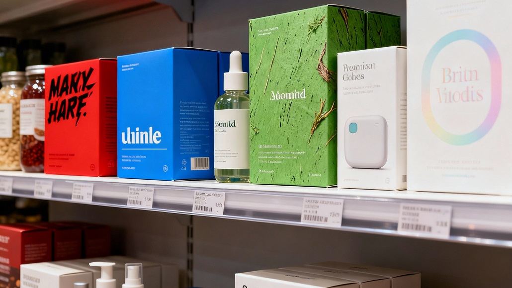
Red packaging typically signifies excitement, urgency, and energy, making it particularly effective for impulse purchases and food products that benefit from appetite stimulation. This color creates psychological urgency that can accelerate purchasing decisions while conveying passion and boldness that appeals to consumers seeking dynamic brand experiences.
Blue packaging design conveys trust, reliability, and professionalism, making it popular for financial services, technology products, and cleaning supplies where consumer confidence is paramount. The calming and stable associations of blue help establish credibility and reduce purchase anxiety, particularly for products requiring consumer trust and long-term commitment.
Green packaging communicates natural freshness, environmental consciousness, and health benefits, appealing to consumers who prioritize sustainability and wellness. This color choice particularly resonates with health-conscious demographics and environmentally aware consumers who seek brands that align with their values.
Cultural Considerations and Global Applications
Color meanings vary significantly across cultures, requiring sophisticated understanding when developing packaging for global markets. While certain color associations remain relatively consistent worldwide, cultural contexts can dramatically alter consumer responses to specific color choices, making cultural sensitivity essential for international packaging success.
In Western cultures, white packaging often represents purity, cleanliness, and premium quality, while in some Eastern cultures, white can be associated with mourning or bad luck. Similarly, red may signify good fortune and celebration in Chinese culture while representing danger or warning in other contexts.
Successful global packaging strategies often incorporate cultural color preferences while maintaining brand consistency across markets. This approach requires careful research into local color associations and preferences, often resulting in subtle variations in color application while preserving core brand identity elements.
The psychological impact of color combinations also varies culturally, with certain pairings carrying specific meanings or emotional associations that can enhance or undermine marketing messages depending on the target market’s cultural context.
Functional Color Applications
Beyond psychological impact, color in packaging serves important functional purposes that directly affect consumer experience and product performance. Color choices can influence perceived product taste, effectiveness, and quality while providing practical benefits such as shelf visibility and brand recognition.
Studies demonstrate that packaging color significantly affects perceived taste in food and beverage products, with warm colors often associated with sweet flavors and cool colors linked to refreshing or minty sensations. These associations can enhance product appeal when colors align with flavor profiles while creating confusion when mismatched.
Color psychology in packaging also affects perceived product efficacy, particularly in categories like cleaning products, cosmetics, and pharmaceuticals where color can signal strength, gentleness, or specific benefits. Bright colors might suggest powerful cleaning action, while soft pastels could indicate gentleness suitable for sensitive skin.
The strategic use of color contrast helps products stand out on crowded retail shelves while creating visual hierarchy that guides consumer attention to key information and brand elements. High contrast combinations can increase visibility and recognition, while subtle color variations might appeal to premium market segments seeking sophisticated aesthetics.
Typography Choices and Brand Recognition
Font Psychology and Brand Personality
Typography in packaging design communicates brand personality and values through carefully selected font styles that evoke specific emotional responses and associations. The choice between serif, sans-serif, script, or decorative fonts significantly impacts consumer perceptions of brand character, product quality, and target demographic.
Serif fonts, characterized by small lines or strokes at character ends, traditionally convey heritage, authority, and professionalism. These fonts often appear on luxury goods, academic materials, and products aimed at mature demographics who appreciate traditional aesthetics and established credibility.
Sans-serif typography presents clean, modern aesthetics that suggest innovation, efficiency, and forward-thinking approaches. These fonts particularly appeal to younger demographics and technology-focused brands seeking to communicate simplicity, accessibility, and contemporary relevance.
Script typography resembles handwritten text and often conveys elegance, sophistication, or personal touch depending on specific style choices. These fonts work effectively for luxury products, artisanal goods, or brands seeking to create intimate, personal connections with consumers.
Decorative fonts offer unique character and personality but require careful application to maintain readability while creating distinctive brand recognition. These fonts often work best for accent applications or brands targeting specific niche markets where differentiation is paramount.
Readability and Information Hierarchy
Typography in packaging must balance aesthetic appeal with functional requirements for clear communication and easy information processing. Effective typography creates visual hierarchy that guides consumers through essential product information while maintaining brand consistency and shelf appeal.
Primary typography typically features the largest, boldest fonts to highlight brand names, product types, or key selling points. This level requires maximum impact and recognition, often utilizing custom fonts or distinctive styling that reinforces brand identity and creates memorable shelf presence.
Secondary typography serves medium-priority information such as product varieties, flavors, quantities, or important features. This level requires clear readability while supporting the primary typography without creating visual competition or confusion.
Tertiary typography handles detailed information including ingredients, instructions, regulatory requirements, and contact information. This level prioritizes clarity and compliance while maintaining design consistency through appropriate font choices and sizing.
The integration of multiple typography levels creates effective information hierarchy that helps consumers quickly identify relevant information while maintaining visual appeal and brand consistency across diverse product lines and market contexts.
Cultural Typography Considerations
Typography choices must consider cultural reading patterns, language characteristics, and aesthetic preferences when developing packaging for diverse markets. Different cultures have varying preferences for font styles, spacing, and layout approaches that can significantly impact packaging effectiveness.
Left-to-right reading cultures typically organize information differently than right-to-left reading cultures, requiring adjustments in typography layout and visual hierarchy to accommodate natural reading patterns and information processing preferences.
Language characteristics such as character complexity, word length, and spacing requirements influence typography choices and layout decisions. Languages with longer average word lengths may require different sizing and spacing approaches compared to more concise languages.
Cultural associations with specific typography styles can vary significantly, with fonts carrying different connotations and emotional associations across cultural contexts. Understanding these variations ensures typography choices support rather than undermine intended brand messages and consumer connections.
Combining Color and Typography for Maximum Impact
Creating Visual Harmony
The successful combination of color and typography in packaging design requires careful attention to visual harmony, contrast principles, and brand consistency. Effective integration creates cohesive designs that enhance both elements while supporting overall marketing objectives and consumer engagement.
Color and typography must work together to create appropriate contrast levels that ensure readability while maintaining visual appeal. High contrast combinations increase legibility and shelf visibility, while subtle contrasts can create sophisticated, premium aesthetics that appeal to discerning consumers.
The psychological associations of colors and fonts should align and reinforce each other rather than creating conflicting messages or emotional responses. Warm colors paired with friendly fonts create approachable, energetic impressions, while cool colors combined with modern typography suggest professionalism and reliability.
Brand consistency requires coordinated color and typography applications across product lines, marketing materials, and customer touchpoints. This coordination builds recognition and trust while creating cohesive brand experiences that strengthen consumer relationships over time.
Strategic Differentiation
Packaging design color typography combinations can create powerful differentiation strategies that distinguish brands from competitors while appealing to specific target demographics. Strategic choices help products stand out in crowded categories while communicating unique value propositions.
Analysis of competitor packaging reveals opportunities for differentiation through distinctive color and typography combinations that create unique market positions. Brands can identify underutilized color spaces or typography styles that offer differentiation opportunities while remaining appropriate for target markets.
Premium positioning often utilizes sophisticated color palettes paired with elegant typography to justify higher pricing and attract affluent consumers. These combinations communicate quality, exclusivity, and attention to detail that supports premium brand positioning strategies.
Value positioning might emphasize bright, accessible colors with clear, straightforward typography that communicates affordability, practicality, and broad appeal. These approaches target price-conscious consumers while maintaining positive brand associations and shelf appeal.
Best Practices and Case Studies in Packaging Design
Technology Industry Excellence
Apple’s packaging demonstrates masterful integration of color and typography to create premium brand experiences that justify higher pricing while building customer loyalty. The company’s consistent use of white space, minimal color palettes, and elegant typography creates sophisticated packaging that reinforces brand values of innovation, quality, and attention to detail.
The strategic use of white backgrounds creates clean, premium aesthetics while allowing product imagery and minimal typography to command attention. This approach communicates confidence in product quality while appealing to consumers who appreciate understated luxury and sophisticated design.
Apple’s typography choices emphasize clarity and modernism through carefully selected fonts that remain consistent across product lines. This consistency builds brand recognition while creating cohesive experiences that strengthen customer relationships and justify premium positioning.
Beauty Industry Innovation
Glossier has achieved remarkable success through packaging that combines soft, approachable colors with modern, friendly typography to create brand experiences that resonate with millennial and Gen Z consumers. Their pastel color palettes paired with clean, contemporary fonts communicate authenticity, accessibility, and modern beauty ideals.
The brand’s packaging strategy differentiates their products in a category traditionally dominated by elaborate, heavily decorated packaging. By embracing simplicity and authenticity, Glossier appeals to consumers seeking genuine, uncomplicated beauty solutions rather than aspirational luxury positioning.
Consistent application of their color and typography strategy across products creates strong brand recognition while maintaining flexibility for product line extensions and seasonal variations. This approach builds customer loyalty while supporting business growth and market expansion.
Food and Beverage Applications
Coca-Cola’s packaging represents one of the most successful long-term applications of consistent color and typography strategy in consumer goods. Their distinctive red color combined with classic script typography creates instant global recognition while maintaining emotional connections across diverse cultural contexts.
The brand’s ability to maintain core color and typography elements while adapting to local preferences and seasonal variations demonstrates sophisticated global packaging strategy. This approach preserves brand equity while remaining relevant to diverse consumer segments worldwide.
Recent innovations in Coca-Cola’s packaging, including personalized name campaigns and limited editions, show how established brands can evolve their color and typography applications while maintaining core brand recognition and emotional connections with consumers.
The success of these case studies demonstrates that effective packaging design color typography strategies require consistent application, cultural sensitivity, and continuous evolution to maintain relevance while building lasting consumer relationships that support business growth and market leadership.


